

Colour in Training is Not Decoration. It is Instruction.

Updated: Sep 24

Anyone who knows me knows that I love colours.
Colourful clothes. Colourful makeup. Colourful home décor. And, of course, colourful training.
My love of colour doesn't mean every course should look like a box of crayons. It means every colour should have a purpose.
So, it probably won't surprise you that colour is one of my favourite topics in instructional design. But my appreciation for colour has very little to do with aesthetics.
It's about learning.
When people talk about training design, the conversation often turns to colours surprisingly late.
The content has been written. The activities have been developed. The slides are nearly finished.
Then someone asks, "What colours should we use?"
That question comes too late.
It assumes colour is decoration.
It isn't.
Colour is one of the most powerful instructional tools we have. It helps learners notice, organize, interpret, and remember information. Used well, it reduces mental effort. Used poorly, it competes with the learning itself.
Whether training takes place in a classroom, a virtual instructor-led session, or an eLearning module, colour should never be chosen simply because it matches a corporate brand or looks attractive.
The better question is this:
How does this colour choice help someone perform their job?
Colour Should Reduce Thinking; Not Create More of it
One of the goals of instructional design is to reduce unnecessary cognitive load. Learners should spend their mental energy understanding concepts, solving problems, and applying new skills—not figuring out where to look next.
This is where colour becomes surprisingly powerful.
Imagine a maintenance training program teaching technicians how to inspect hydraulic components on an aircraft.
If every diagram consistently uses one colour for hydraulic systems, another for electrical systems, and another for inspection points, learners immediately recognize what belongs together. They spend less time searching and more time understanding.
Now imagine those same diagrams using different colours on every page.
The information hasn't changed.
But the learner now has another problem to solve.

Good instructional design removes unnecessary problems.
It doesn't create new ones.
Research on multimedia learning has consistently shown that thoughtful colour coding helps learners locate related information more efficiently, reducing unnecessary visual search and improving learning outcomes.
The issue is not that colour improves memory by itself.
The issue is that good colour design helps learners focus their attention where it belongs.
Working Within a Brand Doesn't Mean Working Without Colour
One argument I hear quite often is:
"We have to follow the company's branding."
That's true.
As instructional designers, we absolutely need to respect an organization's visual identity. Many corporate colour palettes are intentionally conservative, relying on shades of blue, grey, or other neutral colours to project professionalism and consistency.
But respecting a brand doesn't mean designing a monochromatic learning experience.
There is almost always room to introduce additional colours intentionally and purposefully.
Accent colours can distinguish procedures from reference information. They can separate examples from definitions, identify warnings, highlight decision points, or guide learners through complex diagrams.

The key is that these colours support the learning rather than compete with the brand.
Good instructional design doesn't choose between branding and effective learning.
It finds a balance between the two.
Consistency Matters More than Creativity
One mistake I often see is treating every slide, participant guide, or eLearning screen as its own design project.
Every section uses different colours.
Every icon has a different meaning.
Every activity introduces another visual convention.
While this may look creative, it forces learners to continually interpret the interface instead of concentrating on the content.
Consistency is one of the simplest ways to reduce mental effort.
If blue represents procedures, keep it that way.
If orange highlights warnings, use it consistently throughout the course.
If green indicates successful completion, don't suddenly use it for optional content.

Just as we expect words to maintain their meaning throughout a course, colours should communicate consistently.
Learners should never have to relearn the visual language.
Colour Creates Hierarchy
Training materials often suffer from having everything appear equally important.
Every heading is bold.
Every sentence is highlighted.
Every box uses a different accent colour.
Ironically, when everything demands attention, nothing truly receives it.
Good use of colour creates visual hierarchy.
It quietly answers questions before learners even ask them:
Where should I start?
What deserves my attention?
What is supporting information?
What action should I take next?
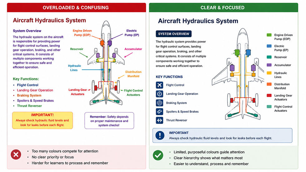
When learners always know where to look, they can devote more attention to understanding and applying what they are learning.
That is good instructional design.
Not good decoration.
Safety Colours Already Have Meaning
In aviation, manufacturing, healthcare, energy, and many other regulated industries, colours are not simply design choices.
They already communicate operational meaning.
Red may indicate emergency equipment.
Yellow often signals caution.
Green commonly identifies emergency exits or safe conditions.
Blue may represent mandatory actions or required personal protective equipment, depending on applicable standards and workplace practices.
Instructional designers should be careful not to undermine those established conventions.
Imagine using bright red throughout an eLearning course simply because it matches the company's branding.
Or using green to highlight optional information when employees already associate it with safe operating conditions.
Learning materials should reinforce the visual language employees already encounter in their workplace—not compete with it.
The closer the training environment reflects the operational environment, the easier it becomes for learners to transfer knowledge to the job.
Accessibility is Not Optional
Not every learner experiences colour in the same way.
Some have colour vision deficiencies.
Others attend classroom sessions where projectors wash out colours.
Some complete eLearning on mobile devices outdoors.
Others work on older monitors with poor colour reproduction.
If colour alone communicates important information, some learners will miss it.
That is why accessible design recommends pairing colour with labels, icons, symbols, patterns, or text.
A warning should still be recognizable even if someone cannot distinguish red from green.
A process map should still make sense if printed in black and white.
Accessibility is often viewed as a compliance requirement.
It is also good instructional design.
Anything that reduces ambiguity benefits every learner.
The Best Colour Choices are Often Invisible
Participants rarely leave a course saying,
"I really liked the colours."
But they may leave saying the course was easy to follow.
That the diagrams made sense.
That they always knew where to look.
That the activities felt organized.
That learning seemed easier than they expected.
Those reactions are often signs of excellent visual design.
When colour is used intentionally, learners stop noticing the colours themselves.
They notice that learning feels effortless.
One question I often encourage trainers and instructional designers to ask is not:
"Which colours should we use?"
Instead, ask:
"What should learners notice first?"
That simple shift changes the conversation.
Colour stops being decoration.
It becomes a performance support tool.
The purpose of colour is not to impress the learner.
It is to help the learner succeed.


Comments